Wednesday, July 24, 2013
LM x LM
Watercolor I did before work… Just experimenting… :)
Lisa-Marie is a spoiled and absolute terror of a princess from a distant planet. When Lisa-Marie’s parents agree to have her take part in an arranged marriage to stop a war between their feuding twin planets, the disgruntled princess is sent her to Earth to gain a better perspective on life. Her parents decide the best way to do this is to start from scratch so, they de-age her from 23 to 8 years old.
-
I want to start getting in to the habit of sharing info about my original characters instead of just posting a picture. Lisa-Marie is a character I've worked on for many years. I created her in middle school when I was 11 years old.
I would love to make a comic about her someday.
Wednesday, April 10, 2013
Watercolor Sketches!
I really enjoy doing these as they are extremely therapeutic and help me prepare for the stressful day ahead. Plus--- Watercolor Practice! :D
Also, fun fact: To some folks who might this interesting, the guy in the bottom left corner, is the father of the little boy who appears in my 2011, “Phi-Phi on the TV” animation. His name is Bernard "Benny" Martin... :)
Tuesday, March 19, 2013
Yay Contest!
First Entry (You can use it as a wallpaper--- ONLY):
Second Entry:
It's my second entry that I won 2nd place. Coming up with the idea for this was super fun! I wanted to portray the characters from the show in strong as but also have them in a fun settinh. So I thought, "why not Roller Derby?", because I've always wanted to try it.
Friday, November 23, 2012
Logo work!
Yay! I can finally put this up! About a year ago, I become the sole Graphic Designer for a company called Community Labor United, they wanted me to design their new logo. I'm not sure if they'll ever use it for anything, but I learned so much working with them, as it was my first professional commission.
I will admit, I had a lot of fun coming up with the design, since I love creating logos. My clients asked for a "sketchy, traditional" feel, which is why this logo was not vectorized, I did every thing by hand. I got to work with ink which is always fun!
They were looking for a "Russian Propaganda Poster" type logo, with determined looking folks, stating next to each other looking up. Eventually, my clients told me to remove the people, and asked that I instead include a strong, "feminine" arm to symbolize labor. The background is suppose to symbolize the connection of the downtown community to the urban community, linked together by The Zakim Bridge.
I was super excited with how the background came out, as don't work on backgrounds often. However, this project helped me learn what I'm capable of and that I shouldn't limit myself.
Saturday, September 8, 2012
Marker Painting!
I feel like eventually I should show a walk through process, but I guess there will be time for that later if I decide to continue working in this technique... Which I probably will... :)
I really like the look of it, but I'm still trying to get comfortable with it and take risks. It's a learning process I'm more than happy and willing to go through.
This is my character Leo-Rey, "The Last Golden Monkey" from the jungle planet, Oasis. Being the last golden monkey, he's adopted... By an Alligator. He also has a pet cobra. His earlier character design appears in my 2010 animation, "DTV".
I recently redesigned Leo-Rey and made a progress sheet for him.
The first one was done the year I graduated from high school, the second was done a year before I graduated from college, and the last was done a year after college. The one from 2010 wasn’t so much an update of my style, as it was me purposefully drawing the same character, in the same style from 2006.
Now, when I draw Leo-Rey in this more “cartoony” style, I want to showcase his more animated and hyper personality that I don’t feel I was getting across in the way I originally drew him. I’m going to mess around with his design until I’m more pleased with it, but I like the direction he’s going in.
Also, I recently created another marker painting for my mother's birthday.
Princess Aoi is a character I made for my mom's birthday last year that worked themselves into the continuity of a story with my other characters. Princess Aoi is a pixie and she is the Princess of Seifa-utaki forest.
Aoi's battle outfit is a combination of Japanese and Spartan style armor, as well as a couple of others. Even though Aoi lives in Japan, her armor is a bit of a hodgepodge...
I'm not entirely happy with this... There are a lot of mistakes... I feel that things got a little too muddled together and the highlights & shadows are sort of off, but as long as my mom's happy with it, I guess that's all that counts. :)
Funny thing though... I drew the leaf on Aoi's helmet the way I did because, truthfully, I wanted it to look all "swirly and pretty". However, I realized after I finished this picture that it's shaped like an "S". My mom's name is Sandra... ♥
Happy Accidents FTW.
I will say that with my first Princess Aoi picture that was created last year around the same time just a few posts down from this one, I really need to start picking up the pace with my updates. Well, I am making new film, so hopefully more news on that soon!
Wednesday, February 1, 2012
I am internally SCREAMING.
This was drawn spontaneously before I started my shift at work. It's more of a representation of the cumulative rage of my emotions about life in general and not based on any particular life event. I don't want folks to worry ;)
Colored in Photoshop CS3, experimenting with textures and shifting color channels.
Saturday, September 3, 2011
I'm posting this and I don't care!
Usually, I try not to post my fan art work up here because I don't free that it always showcases my best work and in some cases I don't put as much time and effort in to them.
This is not one of those times.
A few months ago I got into the wonderful series, My Little Pony: Friendship is Magic created by the amazing Lauren Faust. It helped break up the stress & insanity that was my last semester of college, so I extremely grateful for that.
Since I'm out of school and finally have free some time (to much free time) I decided to make some fan art based on one of my favorite MLP episodes called, "Suited for Success".
I wanted to draw this traditionally as opposed to digitally because I seldom ever see anyone make traditional MLP fan art and because I haven't worked in maker in a while. I know there are a lot of mistakes, I still might go back and add a couple of things... >.>
It took me forever to finish... I tried to keep to the original designs as much as possible. Each girl took about a day to complete.
Also, in case you were wondering, here's what the characters looked liked originally:
Wednesday, July 27, 2011
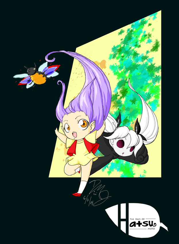
Hatsu Timeline: 2007-2011
Anyway, my final consisted of making a summary, character sheets, and a comicbook page. I thought I'd use my character Hatsu Moto, the mini forest emp, since she's been present throughout my time in college.
2007:
Hatsu is a relatively recent character. She was created during a watercolor drawing practice assignment during my first semester of college:
2008:
I was finally able to get my hands on my own copy of Photoshop CS3! I was so excited that I thought I'd try my hand at digital drawing.
This was my first completed digital drawing in Photoshop ever. Not to great, but it was a start.
Later that year, I completed my Animation 2 college course by creating a faux animated opening title sequence called, "The Days Of Hatsu Moto" :)
2009:
2009 was the year I tried my hand at digitally coloring a full animation for my Animation 3 college course. The animation was never finished because that kind of digital coloring took way too long to complete for each individual frame. However, Hatsu, and several of my other original characters are featured in it.
2010:
Hatsu is one of several of my original characters to be featured as a guest in my degree project talk show animation, "DTV". She was only featured for a few seconds, but so far she seems to get the best viewer reaction than any other character in the animation. She is voiced by me.
2011:
Finally, for one of my last classes in college, The Grapic Novel, we had to make a summary, character sheets, and a comicbook page. So, I thought, "why not use Hatsu?"
Summary:
The Days Of Hatsu Moto takes place in present day Los Angeles. The story chronicles the life of a mini forest imp named Hatsu Moto and her quest to save a man’s soul from his own ill-deeds and crude personality, which has been prophesied will lead to is death 3 years from now.
Hatsu plays the literal conscience to Rodney, the man who she’s supposed to “save”. She does this by accompanying Rodney where ever he goes and by putting him through many seemingly ridiculous tests, much to his dismay.
Despite her tiny size (she’s only 5 inches tall), Hatsu is very resourceful, and having magical powers doesn’t hurt either. Rodney initially despises Hatsu’s presence and finds her constantly chipper attitude and high-pitched voice extremely annoying. However, he very slowly starts to warm up to her.
Character Sheets:Comic Page:
--
And that's about it... Hatsu's history since '07 :)
I felt happy doing this because it made me feel so sentimental. As a character, Hatsu was born during my first year of college, in one of my first courses. For those who don't know, Hatsu means "first" in Japanese (å). Throughout my college years Hatsu Moto has been a resource for me to use to push myself to try new things. And while all those things may not have worked, I still learned so much from doing them and I'm a better artist/person for it.
So thank you Hatsu, my little forest imp :) <3
Friday, July 8, 2011
Sunday, May 29, 2011
Tuesday, November 23, 2010
MassART T-shirt contest designs!

I actually won last year which was great. However, I still feel like I have no chance of winning regardless, because within minutes they had all ready picked a favorite and seemingly ignored everyone else's :(
Oh well, at at least I won once.
Friday, November 5, 2010
I'm doing something, I promise...
I put this together really quick... I've been doing some color collaborations lately. Nothing big, but I thought I'd share.
Line work by Bryan Lee O'Malley. Colored in Photoshop CS3.
Line work by Brittany Inglese. Colored in Photoshop CS3.
I realized I really like coloring line work other than just my own. It's fun! Send me a suggestion for some stuff to color if you'd like :)
Monday, October 11, 2010
This is a copyright page!
It's mostly blank for the reason that if Artist In Wonderland were to be published, this is where all of the copyright would go.
Monday, August 23, 2010
"Artist In Wonderland" title page
Sunday, July 25, 2010
Wednesday, June 23, 2010
Artist In Wonderland Preview: Progress Page 10
Go me!! :D
Anyway, I thought I'd share the process work for one of my upcoming comics I'm doing this summer, "Artist In Wonderland". The comic was created for my Narrative Illustration class.

The story is about me as I journey from the real world to Wonderland on a really bad day. The story features me and my friends Amanda Myers, Erika "Rew" Hapke, and Andrew Clapper.
Here's the process work of page 10
First, I drew a crappy little thumbnail drawing of the page. It's about 2 and a half inches in size.
Next, is the bigger thumbnail drawing that maps out the final page. This is about 4 x 5.5 inches in size.

After that, is a clean sketch of the final comic page. The page was drawn at 12 x 16 inches in size.
NOTE: Since this comic was intended to be sketchy (by both my teacher and myself), there is no need to ink the sketch. It can be colored right after this step.

After I scan the picture on to the computer, it's time for coloring! My favorite! I start off with only flat colors.

Then, I add the shadowing. Three layers of shadows were used for this page.
Finally, the highlights. I LOVE shininess!
And there you go! <3
So...What do you think? :D
Thursday, June 10, 2010
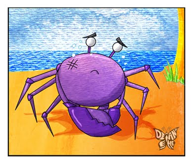
Holy Updating, Batman! Also, a Giant Purple Crab fell to Earth!
I've been completely done with classes for the summer for a little under a month, and let me tell you something: I am so relieved! Degree Project (DP) was NO joke... I barely finished it! And while not totally satisfied with it, I have to at least pat myself on the back for completing something so crazy and difficult. I had to drop one of my critical studies classes just to focus more on DP and I still didn't have enough time! I'll post the mostly finalized version of my Degree Project movie here soon, but I wanted to update the DP blog with all the extra progress work first ^^;
My Animation Portfolio class was really great! I was really stressed at times because I was worried about finding time to work on DP, but it was so awesome getting our professional stuff done. I'll show you all the business cards, dvds, and dvd covers, I did in another post soon! Also, I really need to thank my teacher for being so understanding about my situations with DP throughout the semester. You rock Steve! :D
Narrative Illustration, the class I busted my butt to get into, did not, unfortunately, live up to my expectations, mainly because of the professor who taught the class. Their bad attitude, short-temper, tactlessness, and unwillingness to take responsibly for things, made for a difficult working environment and made me all too glad that I was part of the Animation Department.
Unpleasantness aside, I did learn a lot of great things about narrative illustration. One of our assignments for the class was to make a children's story book with some very odd constraints.
The teacher gave me and each of my classmates a small plastic toy sea creature or insect. We then had to create a short story that started and ended in 8 pages or panels featuring the creature we were given. Also, the story had start with the line, "One Fine Day, a giant _______ fell to earth."
Since I got a purple crab, guess what mine was about... That's right! A DOG! :D
Anyway, I wanted to make the style cute and fun, for a children's book, but also simple to draw as possible. This was because I would have to complete multiple other assignments for this class during this assignment, and I had to worry about work from other classes... Like DP.
I first started the assignment by sketching the whole story on (crappy) normal paper. It didn't need to be perfect, but it had to be clean enough that others could understand it and that I would be able to change it if needed.
Next, linework. I wanted a very clean, but simplistic line, so I decided to do the linework in Flash.
I couldn't figure out at first how I wanted to color it, but I did want to experiment. Finally, I came up with the idea to try a technique I learned from my super awesome teacher from last semester, John Roman.
The technique involved painting with watercolor on watercolor paper or bristol board, then scanning the paper into Photoshop and applying the watercolor to the figure, background, etc.
It didn't make much since, as they only ended up taking the two sheet paper copy version, but my teacher strongly suggested I bind my book together, for the reason that it was meant to be viewed as a storybook. My teacher lightly mocked my lack of book binding skills, and though annoying, it was true. But hey, I did the best I could.
So here's it is the finished product in "comic form", the way I handed it to my teacher.
And before you say it, yes, I know it's missing the word "do ", but I'm not going back through several Photoshop documents just to change it. I'm lazy, I admit it :P
This was a cool assignment and I was very happy with the results. I'm not interested in writing children's books, however I think I would definitely consider illustrating one.
Anyway, thanks for reading! Hopefully I'll have more work up sooner than later... >.>
Saturday, March 20, 2010
Children's Book Illustration revamp
I have been dying to update this thing for a while now but between the stress of my Degree Project and me having to Full Restore my computer twice within a six month period, it has been nearly impossible to do so...
Anyway, since I have a lot to post, I'm going to put my certain art pieces in there own seperate post :D
First, I'm currently taking Narrative Illustration, which I was dying to get into. Admittedly, it is a little frustrating dealing with my teacher, as she can be rather confusing to understand and quick to become agitated at times, but for the most part I am enjoying taking the class.
This is for my first assignment for the class, which was to was revamp a 60's children book we received at random.

All of my other classmates were super happy with their choices, but I got the lamest one though... "How we celebrate Spring holidays" So I did the best thing I could think of, which was redrawing the pictures."
This was the first time I used a Stabilo marker pen to ink my work. Secretly, I always wanted to have a gray inking pen to help make my marker drawings more painterly, but I didn't even know the existed until recently! :D
I think my teacher was a little disappointed in my book, as I don't think she thought I pushed enough to better the story. I just couldn't get my mind to wrap around of how to "better" the book, as the text was seemingly fine and to the point as it was... The pictures however, were rather dull, so that's what I decided to change. In addition, the assignment was first pegged as a one week job, which meant I had to rush in terms of how I was going to get the book completed. I ended up cutting out ten other holidays to be able to finish the assignment on time which was fine, but it didn't give me a lot of time to plan.